Thursday, October 21, 2010

Finally, Small Business Websites That Really Work

To say small business website options have changed in the last 10 years would be an understatement. The story has so many twists and turns, it's difficult to even begin much less summarize in a blog post. So let's bypass the history lesson and break it down to your primary options as of October 2010...


  • Do-it-yourself tools provided by your ISP or hosting company
  • Do-it-yourself tools via third-party company (Intuit, Google, etc.)
  • Open source CMS platform (WordPress, Joomla, etc.)
  • Paid CMS platform (Express Engine, Movable Type, etc.)
  • Custom site developed internally
  • Custom site developed by a third party

So which one do you need?

  • I recommend against the first two, because of severely limited functionality
  • I recommend against the last two becuase if your company really needs advanced web-based technologies, you already know that by now (but keep reading because your cousin's, best-friend's, sister's, great aunt may ask you about her website, and you'll have a good answer)
  • I recommend against a paid CMS unless you just like to spend money

For the vast majority of small businesses seeking to improve their web presence,
I recommend moving to an open-source CMS website.


WHAT IS AN OPEN-SOURCE CMS?

Short answer: Open Source means "free to use", and CMS means "easy to use." If that's good enough for you, skip to the next section. If you'd like a little more detail, keep reading.

A hard-coded website works on a single "layer" of technology - raw html code - which controls everything on a web page: content, appearance, and functionality. Any changes to the site must be made at the "code level", page-by-page and line-by-line. This is a multi-step process which requires specialized software and a solid working knowledge of web programming. If you haven't gone through a comprehensive website review and update in the past few years, chances are pretty good you're site is mostly or entirely hard-coded.

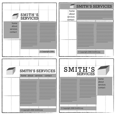
CMS websites work entirely differently by employing three technology layers. The "database" layer controls all the actual content (text, images, etc.) The "presentation" layer controls how the site will appear (layout, fonts, colors, etc.) by means of a template or theme. Finally, the "code" layer employs a specialized programming language (usually PHP) that grabs the content, applies the look-n-feel, and generates html code on-the-fly as pages are called for. A "back-end" administration system links everything together, and allows complete website control from a web browser - no dedicated website software is required.

Sound complicated? It is. But replace the word "complicated" with "advanced" and you're much closer to the truth. In fact, CMS systems are so advanced, they finally make your website work just like you think it should work: fast,efficient, and easy to use while simultaneously flexible, functional, and powerful. If you can use a word processor, you can manage the content of a CMS website.

(Note: Some may take issue with my terms, definitions, and order. Pay no attention to these zealots...)

WHY YOU NEED A CMS WEBSITE

For most small businesses, the days of developing a website from scratch are over. True, some companies have specialized needs that require custom development, dedicated hosting environments, and other hi-tech gadgetry. For the rest, a templated CMS website running on just about any web hosting account will work wonders!

Here's what you get with a CMS website:
  • The entire platform is available with most web hosting accounts - for free!
  • You control the site content without writing a single line of code - for free!
  • Plug-n-play "templates" provide a professional appearance - for free!
  • Custom "modules" offer powerful extended functionality - for free!
  • Most CMS platforms are inherently search engine friendly, with advanced SEO capabilities available - you guessed it - for free!
Yes you read correctly: free...free...free. The simple fact is you can get a very impressive website up and running in less than a day, for free. Sounds too good to be true doesn't it? Well yes, there are some caveats.

TOO GOOD TO BE TRUE? ALMOST...

While you can do this yourself, an experienced CMS resource will make sure you hit the ground running and support you down the road when challenges inevitably arise. Here's how...
  • Your CMS resource will train your staff on how to access and use the administration system.
  • If you have an existing website, or existing content for a website, your CMS resource has the tools and knowledge to correctly migrate all of your content.
  • Most plug-in modules are free but require initial setup and often code modification to integrate fully with your site. Your CMS resource knows how to do this.
  • Most templates/themes are free but also require modification to match your particular preferences or branding requirements. Your CMS resource knows how to fully customize your selected template.
  • CMS platforms requires database connections and occasional database administration which your CMS resource will provide.
  • Your CMS resource will setup specialized redundancies and protections to ensure your site content is never lost, even in the event of malicious attacks or catastrophic failure at your web hosting company.
Despite the promise of an easy, turn-key installation, deploying a CMS has many challenges. Choose a CMS resource that has worked extensively with the platform and can solve these issues to get your new website up and running quickly and correctly the first time. The money, time and frustration you save will more than offset the marginal fees you invest.

Note: Some web hosting environments don't play nice with open-source CMS platforms, especially if you're piggybacking on another company's hosting account or server. Other hosting environments charge more for database capabilities. But fear not; fully compatible web hosting accounts are now so inexpensive (less than $10/mo) making the switch is pretty darn painless.

Well, it's time to queue the Mr. Rodger's theme and bid you fond farewell until next time. I hope you've found something beneficial in this article, and of course if you'd like to learn more about using a CMS for your company website, please contact me anytime.

PS: Yes I am a believer. My new site is running on an open-source CMS :-)  

Friday, October 15, 2010

Secrets to great logo design

Developing a new logo can be a daunting process. Whether you create it yourself, use an online resource, or hire a professional like me, a few core principles will help ensure you have a strong, effective logo that stands the test of time.


A GREAT LOGO IS SIMPLE

If I had a dollar for every logo conversation that went like this, "I really like the logos you proposed, we just want to add a few things..." And within minutes, a solid logo becomes a complete mess.

The most effective logos are simple, elegant marks that represent your business in the consumers mind - nothing more. They do not tell your company history, they do not represent everything you offer.

If worldwide leaders such as the ones above can represent themselves with a simple, stylized mark, the odds are quite good your company can too - and will be better off doing so. Remember, a great logo is not an illustration. Don't fall into that trap.

A GREAT LOGO WORKS WELL IN ONE COLOR

Look again at the logos above. Notice how most are presented in a single color. Even the Mac, Apple and MSN logos were originally developed and are often used in one-color versions.Why is this? Simplicity and reproducibility.

Think for a moment of all the potential applications for your logo: websites, packaging, signage, print collateral, apparel, the list is endless. Some applications have no restriction on color. Others are definitely limited by the medium or reproduction costs. Logos designed purely by on-screen appearance - with multiple hues and fancy effects - will inevitably run into problems later on.

A GREAT LOGO REPRODUCES WELL AT ANY SIZE

Again, the idea here is simplicity. Logos with lots of detail look fine on a website or product brochure where the size can be relatively large and details easily rendered. Now try embroidering the same logo on a polo shirt or in the corner of a customer invoice and it quickly turns to an unrecognizable blob.

When considering your logo options, look at it in one color and sized to fit in a 1/2" square area. If you can easily recognize it, your well on the way to a good solution.

ACCEPT THE FACT THAT NIKE IS A RARE CASE

"I want something really cool that everyone in the world will recognize, like the Nike swoosh."

Yes indeed, don't we all. Here's the rub: that logo has been used (and improved upon) for many years and promoted with billions of marketing dollars. If you have the wherewithal for that kind of commitment, by all means go with a completely generic symbol like Nike - and I'd really like to work with you. Most other companies will be much better off with a simple combination of a company name and a fairly representative symbol (and I'd still like to work with you. :-)

So there you have it, four key principles to help ensure your new company logo works well in every application and endures for years to come. If you'd like help with your new company logo, please drop me a line anytime.

Tuesday, October 5, 2010

Consider copy carefully your...

Occasionally, we all enjoy finding the little ironies in life. For instance, I'm always on the lookout for marketing faux pas, especially by large companies that really should know better.

One of the best known examples is the Chevy Nova. The popular car sold well in anglo markets, but hardly moved at all in hispanic markets. The punchline came when GM product and marketing teams realized Nova ("No Va") literally means "No Go" in Spanish. (Oh if they only had online translators back in the day...)


Today's installment comes from retail packaging brought home by my lovely wife. Let me first say I have no qualms at all with Quilted Northern Ultra Plush; in fact I actually prefer it over most other brands. :-)

However, as I sat down to coffee this morning, I noticed the package above on our kitchen counter. At first, I saw nothing strange, other than a few missing rolls (so why was the package left in the kitchen, but I digress.) Then, like any visual designer worth his salt, I began to peruse the packaging...
  • 3 Ply...yep, that's important
  • Quilted Northern Ultra Plush...can't mist that
  • 24 Double Rolls = 48 Regular Rolls...obviously a bargain
  • Support Susan G. Komen for the Cure...corporate philanthropy, very nice
  • A bunch of boilerplate copy...naturally
  • And then this...


FLUSHABLE ???  Hello - this is 'toilet paper' right? Apart from the occasional sneeze or knee scrape, what would one do with this product if not flush it? Or could it be...gasp...Quilted Norther alone has solved an ancient engineering challenge leaving all the other non-flushable TPs struggling to catch up?!?!?

Of course the point of the mnemonic is that the product is "Septic Safe" which is an important point for many consumers. And I submit those two words alone would have made the point, and informed the buyer, much more effectively - albeit less interestingly.

In the end one may ask, "Does it really matter?" To which I say yes. Does it matter much? Probably not. Will it make or break any buying decisions? Highly unlikely. On the other hand, if well respected and serious consumer brands who spend millions bringing products to market can make such silly mistakes, what about your marketing communications?

Oversights like No-Go Cars and Flushable Toilet Paper are easy to commit, especially the closer you are to the creative process. If you typically generate marketing copy internally, be sure to get unbiased reviews from other staff members before signing off on projects. Better still, a professional copywriter can help ensure you publish the most clear, concise, and accurate information possible.

In the meantime, keep an eye open for more fun examples and let me know what you find...

Saturday, October 2, 2010

Save your layout in three easy step swith SOS !!!

It happens almost weekly: A friend, family member or business associate calls to ask me why this "one little thing" he or she is working on just doesn't look right. Whether it's a flyer, a newsletter, a website, or whatever, the problem is almost always the same. So I developed a fast and easy formula for improving any mess you may have designed yourself into!

Oh I know it's fun building a sales flyer on your computer; pretty colors and gradations everywhere, clip-art from all over the internet (its all free, right?) and just look at how many fonts there are to play with! You add a headline, a logo, a phone number, some written copy, a web address, a photo, a drawing, some more written copy, a special price balloon, a call now button, a chart, a graph, a purple gorilla in a jock-strap...you get the idea...and of course every item is "very important" so you start making things big, bold, tilted, and colorful for emphasis. Hours pass by - maybe days - and suddenly you awake from a dream to see a jumbled mess as if someone dumped a toddlers toy chest on your layout.

So what happened? Well, you probably broke just about every rule in the book of visual design, but we can sum up the results like this: Emphasize everything and you emphasize nothing. But keep the faith, there is a solution. Whether you're working on a newsletter, flyer, webpage, or whatever, and end up with a visual mess on your hands, just remember SOS: Simplify-Organize-Standardize


Simplify - Organize - Standardize

Have you ever followed the annual budgeting processes in Washington, DC? Lawmakers start with a core budget then tack on every amendment, earmark, and appropriation they can think of. Most people faced with creating some type of visual layout work the very same way: start with a core idea and tack on everything else that comes up. In both cases, the results are fraught with problems.

Research tells us most people spend 3-5 seconds viewing any form of static communication such as a flyer, advertisement, or web page. (Web video and tv/radio commercials work differently.) Asking a viewer to sift through umpteen different points and pieces to get your message is a recipe for failure.You must communicate immediately and effectively.

The first step to improving your layout is simplifying it. Determine the top three most important items you're trying to communicate, and make those the focal points of your layout. Let's say you're developing a flier for an upcoming sale, you might end up with a list like this...
  1. Who are you? (Jan's Clothes Closet)
  2. What is your core message? (50%-off Sale This Saturday)
  3. What do you want a viewer to do in response to your message? (Present this flyer in person)
Good, now you have something to work toward. These three items will be the most prominent on your layout. Now decide what of all the the other stuff you really need. A little explanation is good and location and contact information certainly has a place at the table. But show restraint; if it's not absolutely critical to your message, leave it off. If it is absolutely critical, then re-examine your priorities. In the end, no matter how much or how little you have on the page, a viewer must see and understand your three most critical communication points in under 5 seconds.

Simplify - Organize - Standardize

Now that you've simplified and prioritized your communication points, it's time to start building your page or screen layout. There are many resources on the internet for page layout templates, though they generally fall into these categories: grid layout, shape layout, organic layout. Of the three, the grid format is the easiest to work with and universally applicable to print and screen layouts.

A gridded layout is, as you suspect, based on a grid. Imagine a page of graph paper with a somewhat larger than normal grid. Begin with your three priority items. Make them relatively large with your most important item in the top third of the page. As you begin adding other items to your layout, keep the edges aligned to the grid along common horizontal and/or vertical lines. Also leave several areas of the page entirely empty/blank. Negative space is absolutely critical to effective design so fight the urge to fill in these areas.


Simplify - Organize - Standardize

You're now well on the way to a successful layout. The last step is applying a uniform appearance to all the elements on your page; most importantly the fonts and colors.


Fonts

As you know if you've spent ANY time on a computer, there are hundreds of fonts immediately available to you, and literally hundreds of thousands more available free online. With such an amazing variety to work with, you may find yourself constantly switching from font to font simply out of fun and sheer amazement. Okay, we've all done it, so go for it and get it out of your system. Now, let's start standardizing.

Fonts, or typefaces, break down into three families...
  1. Serif Fonts (the ones with the little edges, or "feet" at the tips of the letters)
  2. Sand-serif Fonts (the ones like you're reading now without the little "feet")
  3. Everything else (script, decorative, thematic, foreign, etc.)
If you're the type that just wants the facts, here are some hard-fast 'rules' for using fonts...
  1. Try to use only three fonts on your layout. One for the headline, one for the body copy, and one for sub-headings. Use the italicized version of the font to emphasize words or phrases.
  2. Set your headline in whatever font you like. If you want to appear 'professional' use a serif or san-serif font. If you want to appear 'fun and cool' use some sort of font that matches the theme of your message
  3. Use a serif font such as Times New Roman for your body copy (long written content)
  4. Use a slightly smaller, bold serif font such as Arial Bold or Black for our sub-headings (the titles of sections or paragraphs) 
  5. If you're program allows you to adjust the spacing between letters (technically called "tracking") the set it about 20-25% tighter or closer together than normal.
  6. If you're program allows you to adjust the spacing between lines of copy (technically called "leading") then set it about 20-30% closer than normal for headlines. Body copy is usually fine by default, though remember you can change this in case you need more room for your body copy. (There's a free trick for you!)
Colors

Your computer puts every color under the sun - not to mention shades, gradations, glows, shadows and more - right at your fingertips. And like fonts, colors should be handled intentionally and with restraint to help your communications be effective.

For most purposes, I recommend one of two color schemes...
  1. Analagous colors: These are groups of colors located next to each other on the color wheel
  2. Complimentary colors: are colors located across from each other on the color wheel
  3. Split Complimentary colors: A group of analogous colors with a single complimentary color for emphasis
In my profesional opinion, the Split Complimentary color scheme offers the most flexibility and interest without being overwhelming.

In a Split Complimentary scheme, you use 2-3 analogous colors - such as green, teal and blue - for most of your design, and use a shade of complimentary color - in this case maybe a brick red - to add special emphasis to certain elements on your design. However, do not overuse the complimentary color or you will once again be guilty of emphasizing everything, and therefore emphasizing nothing.

And there you have it: Simplify - Organize - Standardize!

Of course the world of graphic design and page layout goes far beyond these three concepts. But if you find yourself in a visual pickle, with a jumbled flyer or crowded newsletter, just remember SOS. Prioritize your messaging points, and get rid of all the chatter. Use a grid to layout your elements. Pick 2-3 fonts. Use split complimentary colors. And enjoy a more successful communication solutions!

Trust me...I'm a Doctor. ;-)