
 Oh I know it's fun building a sales flyer on your computer; pretty colors and gradations everywhere, clip-art from all over the internet (its all free, right?) and just look at how many fonts there are to play with! You add a headline, a logo, a phone number, some written copy, a web address, a photo, a drawing, some more written copy, a special price balloon, a call now button, a chart, a graph, a purple gorilla in a jock-strap...you get the idea...and of course every item is "very important" so you start making things big, bold, tilted, and colorful for emphasis. Hours pass by - maybe days - and suddenly you awake from a dream to see a jumbled mess as if someone dumped a toddlers toy chest on your layout.
 So what happened? Well, you probably broke just about every rule in the book of visual design, but we can sum up the results like this: Emphasize everything and you emphasize nothing. But keep the faith, there is a solution. Whether you're working on a newsletter, flyer, webpage, or whatever, and end up with a visual mess on your hands, just remember SOS: Simplify-Organize-Standardize
Simplify - Organize - Standardize
Have you ever followed the annual budgeting processes in Washington, DC? Lawmakers start with a core budget then tack on every amendment, earmark, and appropriation they can think of. Most people faced with creating some type of visual layout work the very same way: start with a core idea and tack on everything else that comes up. In both cases, the results are fraught with problems.
Research tells us most people spend 3-5 seconds viewing any form of static communication such as a flyer, advertisement, or web page. (Web video and tv/radio commercials work differently.) Asking a viewer to sift through umpteen different points and pieces to get your message is a recipe for failure.You must communicate immediately and effectively.
The first step to improving your layout is simplifying it. Determine the top three most important items you're trying to communicate, and make those the focal points of your layout. Let's say you're developing a flier for an upcoming sale, you might end up with a list like this...
- Who are you? (Jan's Clothes Closet)
- What is your core message? (50%-off Sale This Saturday)
- What do you want a viewer to do in response to your message? (Present this flyer in person)
Simplify - Organize - Standardize
Now that you've simplified and prioritized your communication points, it's time to start building your page or screen layout. There are many resources on the internet for page layout templates, though they generally fall into these categories: grid layout, shape layout, organic layout. Of the three, the grid format is the easiest to work with and universally applicable to print and screen layouts.
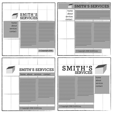 A gridded layout is, as you suspect, based on a grid. Imagine a page of graph paper with a somewhat larger than normal grid. Begin with your three priority items. Make them relatively large with your most important item in the top third of the page. As you begin adding other items to your layout, keep the edges aligned to the grid along common horizontal and/or vertical lines. Also leave several areas of the page entirely empty/blank. Negative space is absolutely critical to effective design so fight the urge to fill in these areas.
Simplify - Organize - Standardize
You're now well on the way to a successful layout. The last step is applying a uniform appearance to all the elements on your page; most importantly the fonts and colors.

As you know if you've spent ANY time on a computer, there are hundreds of fonts immediately available to you, and literally hundreds of thousands more available free online. With such an amazing variety to work with, you may find yourself constantly switching from font to font simply out of fun and sheer amazement. Okay, we've all done it, so go for it and get it out of your system. Now, let's start standardizing.
Fonts, or typefaces, break down into three families...
- Serif Fonts (the ones with the little edges, or "feet" at the tips of the letters)
- Sand-serif Fonts (the ones like you're reading now without the little "feet")
- Everything else (script, decorative, thematic, foreign, etc.)
- Try to use only three fonts on your layout. One for the headline, one for the body copy, and one for sub-headings. Use the italicized version of the font to emphasize words or phrases.
- Set your headline in whatever font you like. If you want to appear 'professional' use a serif or san-serif font. If you want to appear 'fun and cool' use some sort of font that matches the theme of your message
- Use a serif font such as Times New Roman for your body copy (long written content)
- Use a slightly smaller, bold serif font such as Arial Bold or Black for our sub-headings (the titles of sections or paragraphs)
- If you're program allows you to adjust the spacing between letters (technically called "tracking") the set it about 20-25% tighter or closer together than normal.
- If you're program allows you to adjust the spacing between lines of copy (technically called "leading") then set it about 20-30% closer than normal for headlines. Body copy is usually fine by default, though remember you can change this in case you need more room for your body copy. (There's a free trick for you!)

Your computer puts every color under the sun - not to mention shades, gradations, glows, shadows and more - right at your fingertips. And like fonts, colors should be handled intentionally and with restraint to help your communications be effective.
For most purposes, I recommend one of two color schemes...
- Analagous colors: These are groups of colors located next to each other on the color wheel
- Complimentary colors: are colors located across from each other on the color wheel
- Split Complimentary colors: A group of analogous colors with a single complimentary color for emphasis
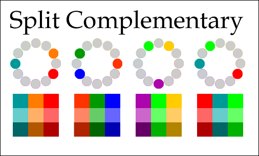
In a Split Complimentary scheme, you use 2-3 analogous colors - such as green, teal and blue - for most of your design, and use a shade of complimentary color - in this case maybe a brick red - to add special emphasis to certain elements on your design. However, do not overuse the complimentary color or you will once again be guilty of emphasizing everything, and therefore emphasizing nothing.
And there you have it: Simplify - Organize - Standardize!
Of course the world of graphic design and page layout goes far beyond these three concepts. But if you find yourself in a visual pickle, with a jumbled flyer or crowded newsletter, just remember SOS. Prioritize your messaging points, and get rid of all the chatter. Use a grid to layout your elements. Pick 2-3 fonts. Use split complimentary colors. And enjoy a more successful communication solutions!
Trust me...I'm a Doctor. ;-)
No comments:
Post a Comment